Lemonade is on a Silicon Valley rocketship to disrupt the insurance industry. In 90 seconds or less you can get an insurance quote that isn't competing against you.
The following is an excellent example of onboarding a user to their Aha! Moment as quickly and painlessly as possible.
Clear promise and expectation setting
This isn't my home address -- all the following info is simply for testing
An example of an onboarding step unselected—when selected it becomes pink. (I chose 'own' here).
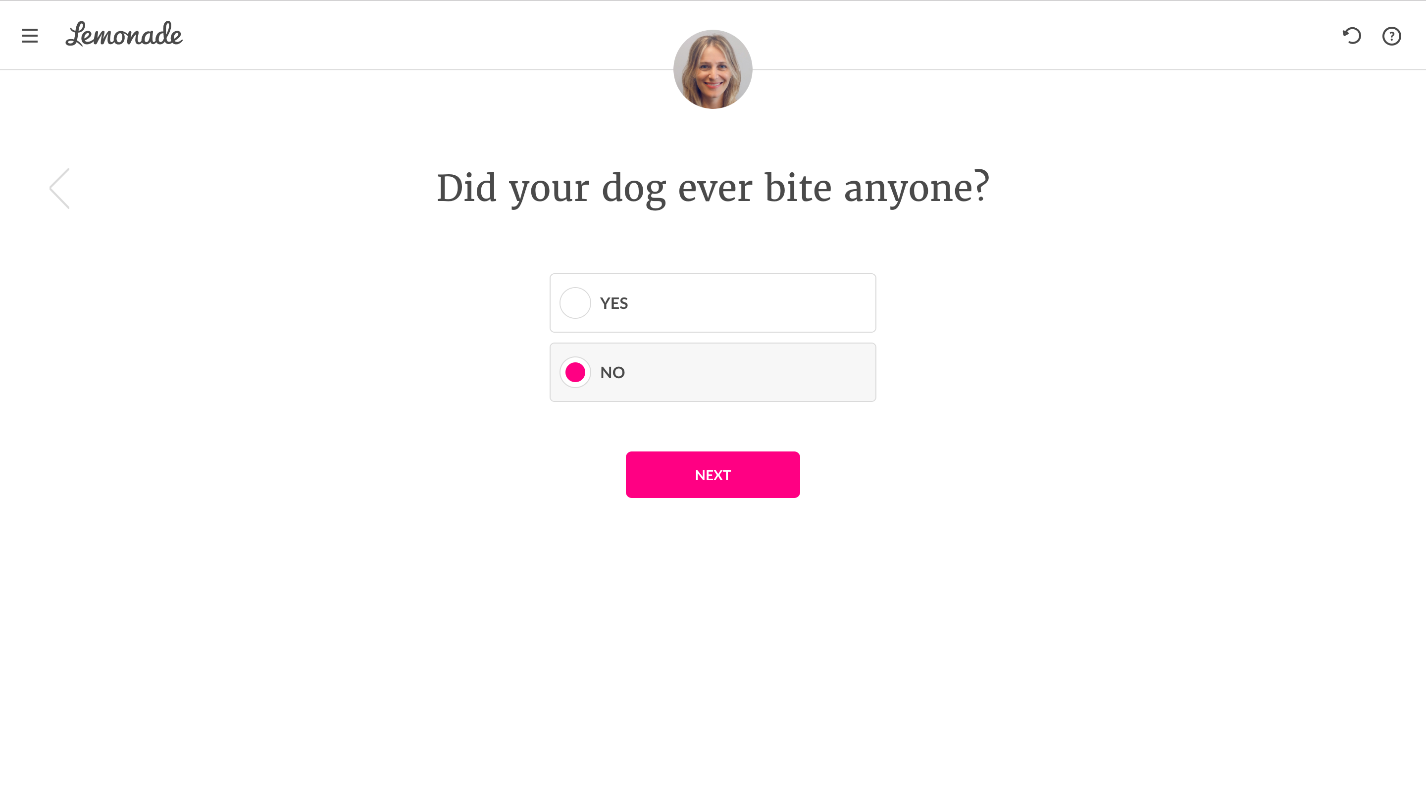
Interesting that there's no progress bar. Wonder if it's because of the branching logic
Also interesting how there's a woman's face above. I suppose she's 'my' virtual agent
Emoji's help me feel like they are relating to us.
The tip below appeared after selecting 'yes'
Each of these screens are very minimal. The text is the super legible. I'm aesthetically pleased
Notice how Lemonade didn't ask for an email up front, but instead waited until I had already taken all of the other steps. Call it a flipped funnel or 'automagical registration'
The waiting screen here builds anticipation
If Lemonade simply spit out a price immediately I might perceive the final product/end result as a bit cheap. The loading and 'number crunching' actually adds to my perceived value.
Your quote is given front and center with two calls to action. My personal agent is seen now bottom right with a reminder of a tip she made earlier. There's a well-known saying in the movie and theater biz that 'if you show a gun in Act 1 it has to go off in the following Act." It's referred to as 'Chekhov's gun.' I looked it up 😉
Down the page a scroll
Down the page another scroll—all the info you might need to customize and understand your policy


.png)
.png)
.png)